Josh Lee James
Digital Product Strategist | Human Experience Evangelist
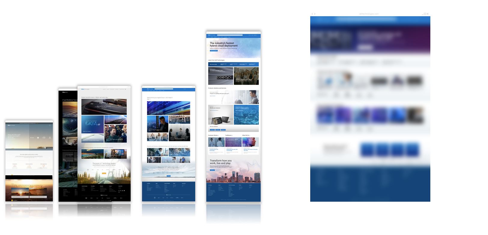
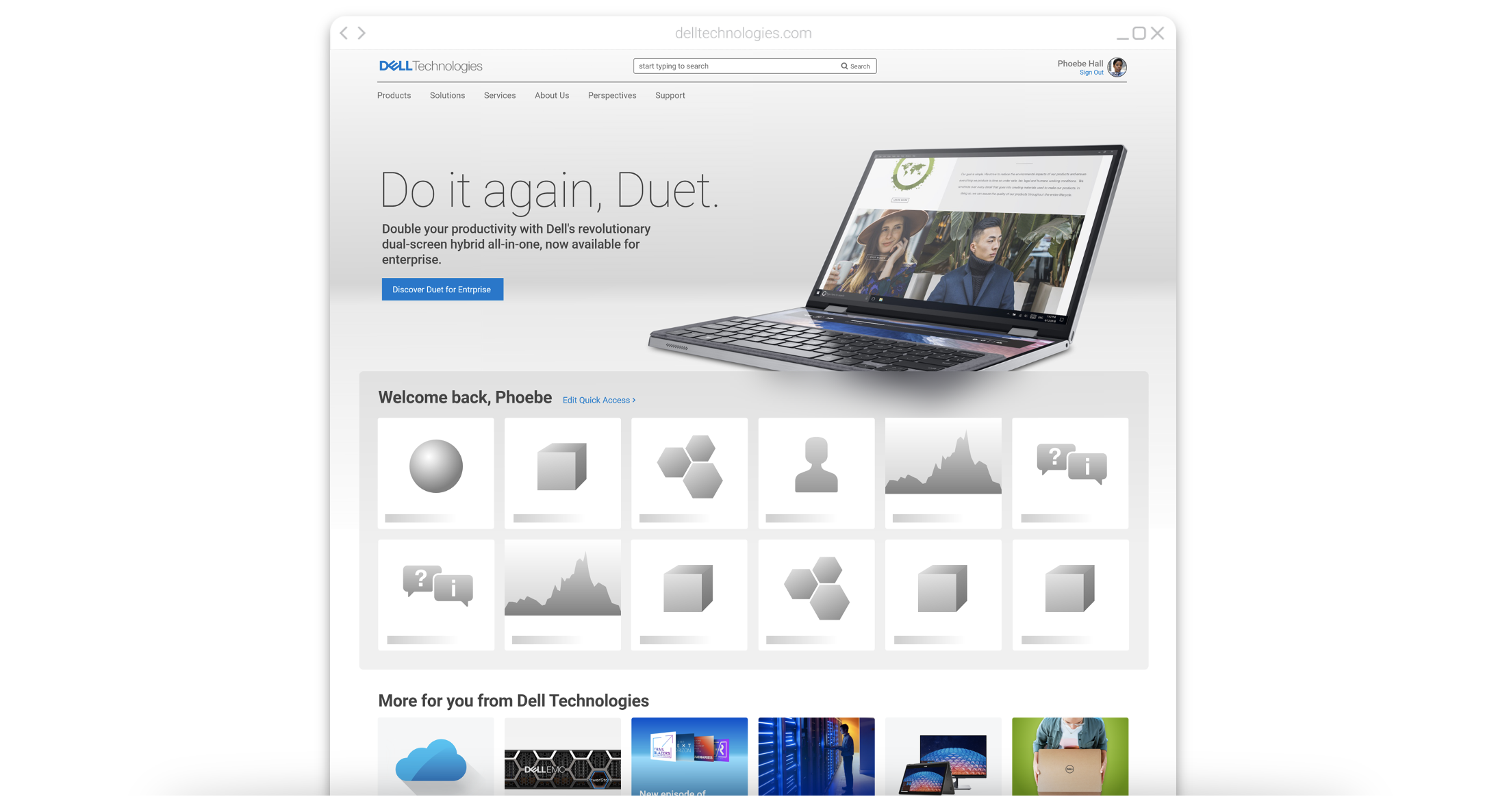
Dell Technologies’ new (in 2019) homepage is a gamble we took that people are over traditional homepages, and are looking for an experience more like their favorite apps.
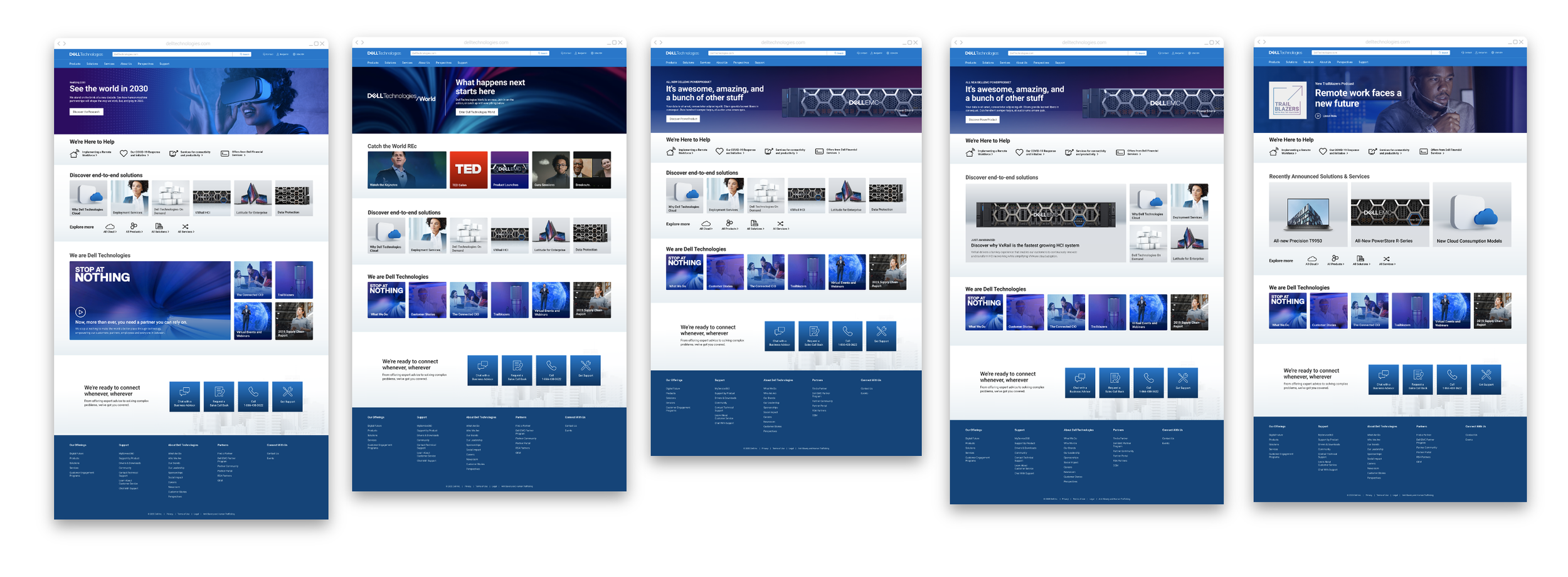
Homepage 2.0 came out of a perfect storm - the Dell Technologies team had just gotten through the unprecedented year that 2020 turned out to be, with a homepage that didn’t fully support the unprecedented needs of a fully-virtual world. Combined with changing stakeholder requirements and lack of user engagement, we knew it was time for a new vision for the homepage.
Before you dive in, if you haven’t already viewed the Homepage 1.0 Megapage project, you might find the context that lead to that project (which was followed by this one) useful!
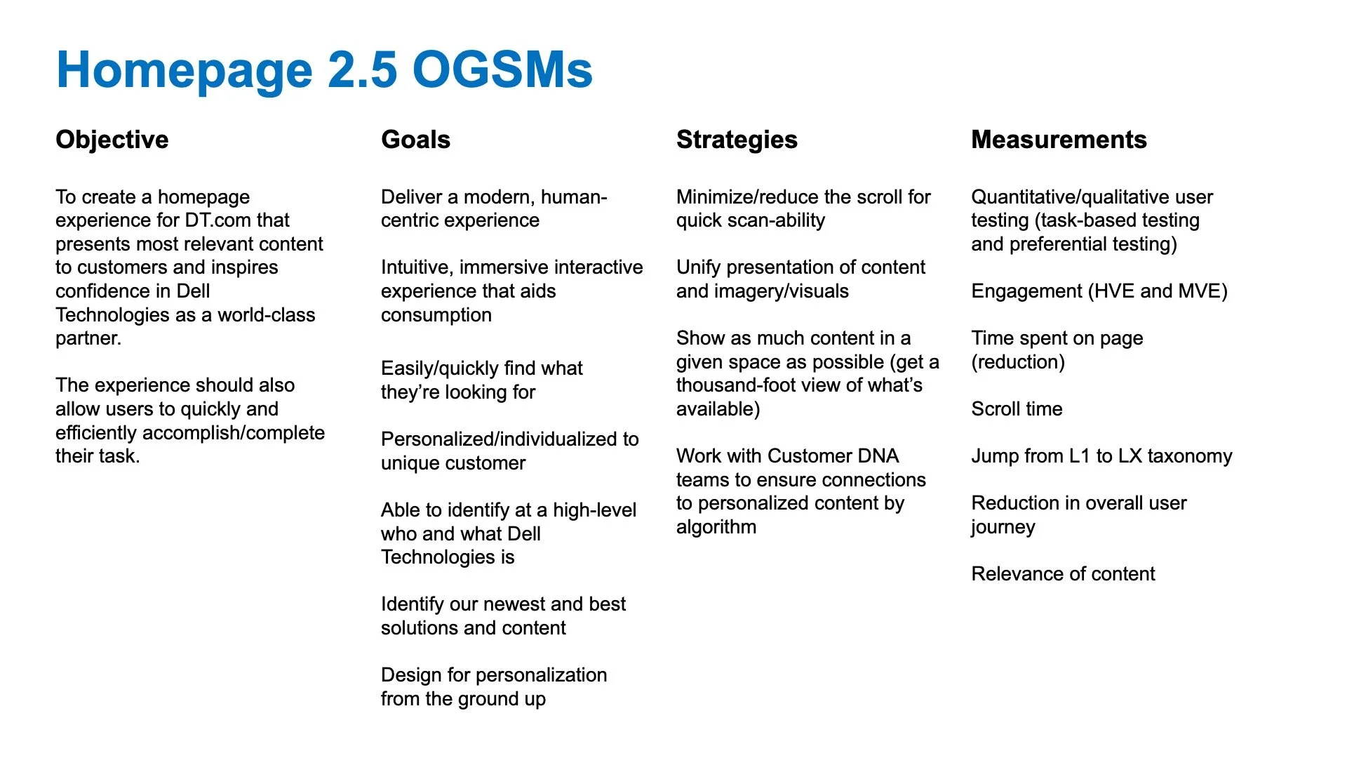
Step 1: Turn the homepage team into a product team and assign the product OGSMs
We were very aware, early on, that the Dell Tech homepage team was set up as a marketing team and not a true product team, which in Dell parlance means that they often reacted to business leaders and not their customers (which is how the Megapage came to be). After seeing how it performed, we decided that the right thing to do for the product overall was to fundamentally change the way the team operated by establishing our proven product team methodologies in which there is a design lead, a product lead, and an engineering lead (three in a box) and then arm them with an OGSM that plots out exactly what they want to achieve with their page.
Step 2: Conduct a mini-discovery to understand what we needed to fix
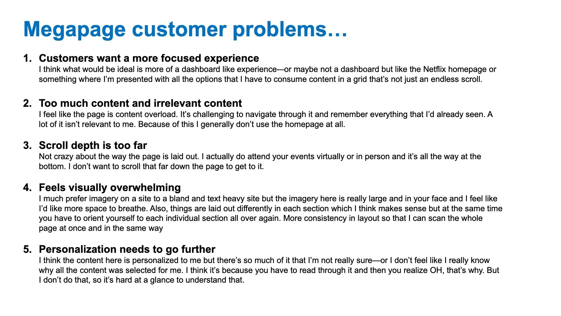
From there, we broke free of some of the legacy-minded processes that Dell Marketing follows and conducted a mini-discovery for this new product in order to align it with some of our HCD (human-centered-design) principles that the product organization follows. This mini-discovery quickly and easily uncovered five key customer pain points that the megapage was causing our customers—and also set us up well to go into solutioning said problems.
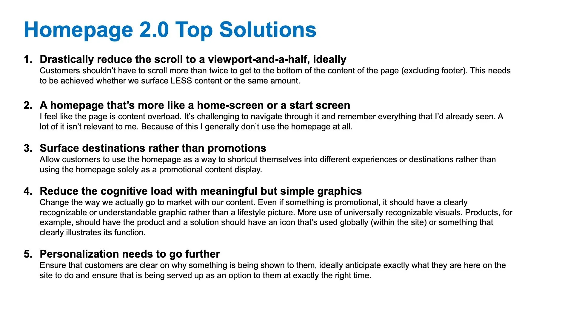
Step 4: Solution, identify, and prioritize the top things we wanted our new design to achieve
Which brought us to our top solutions—and the genesis of the idea that the Dell Technologies homepage could and should be a lot more like a dashboard or a home SCREEN than a home PAGE to better serve and cater to the specific audience that the Dell Technologies site has (high-level, and highly-technical IT professionals).
Step 5: Design Sprint
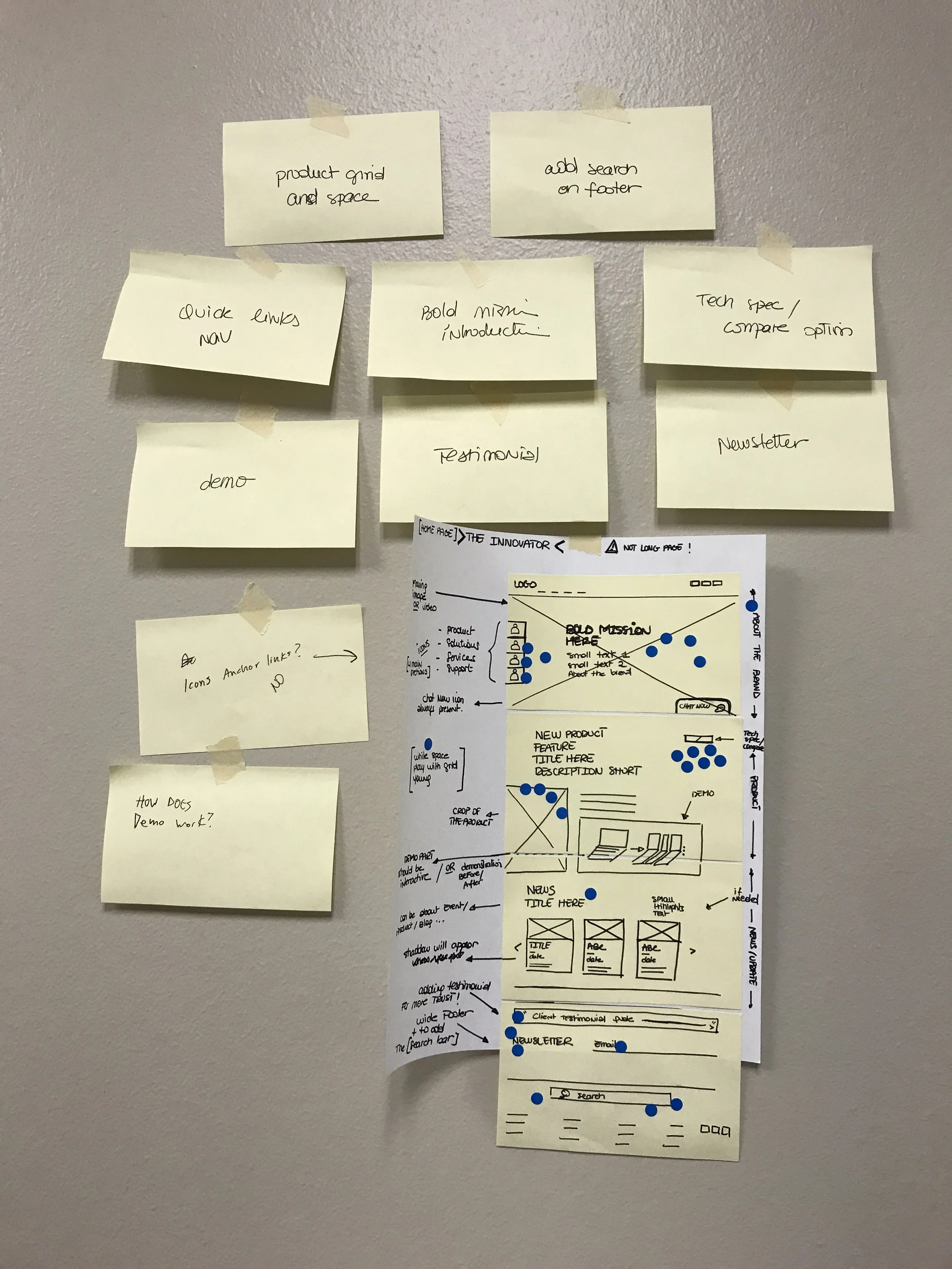
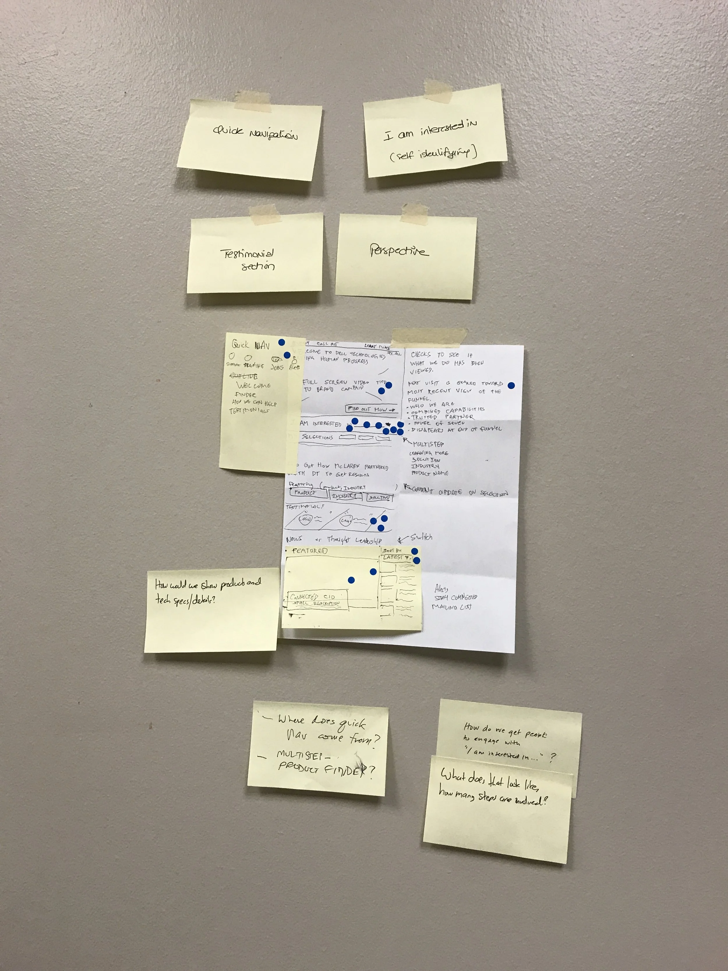
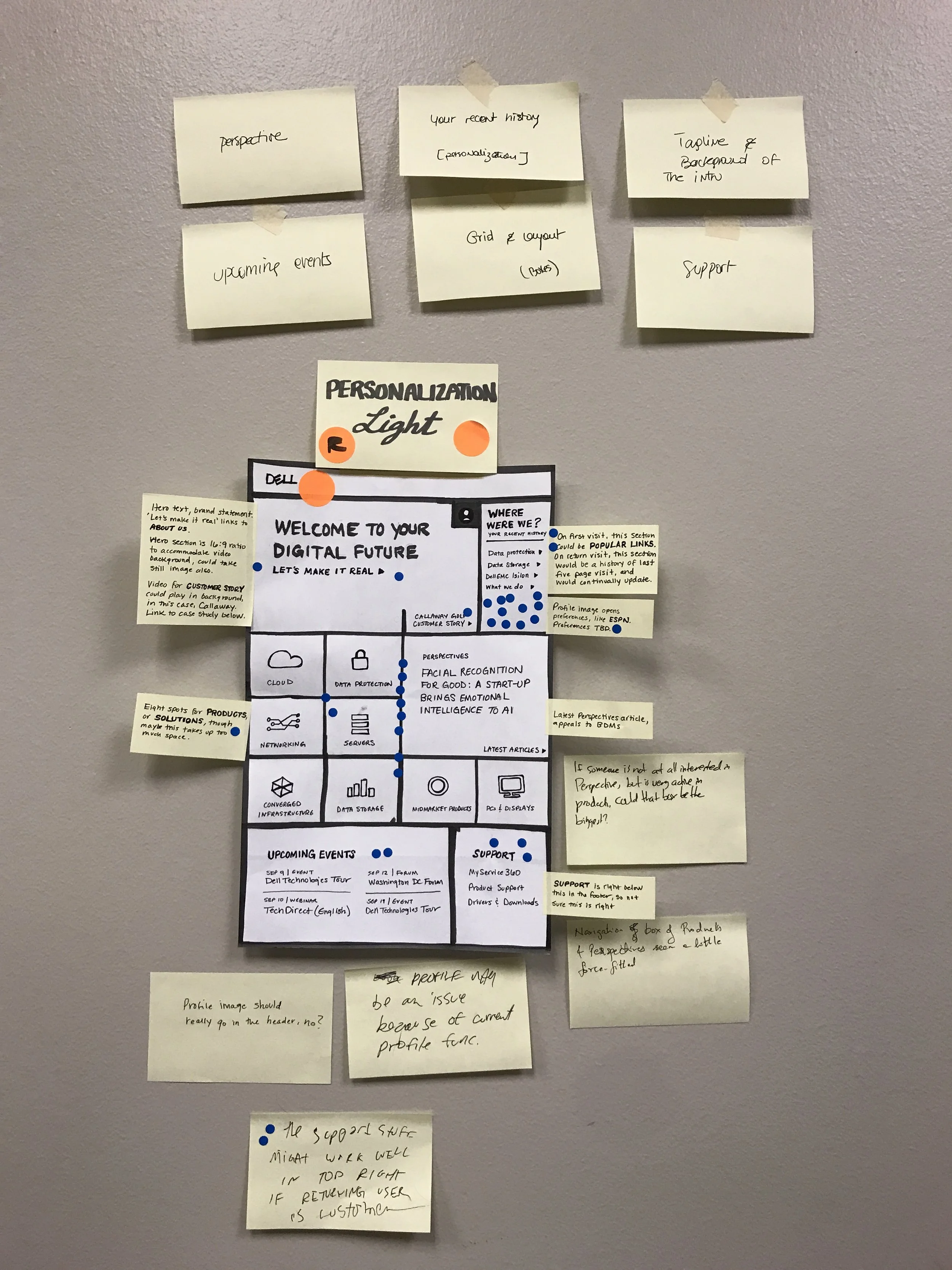
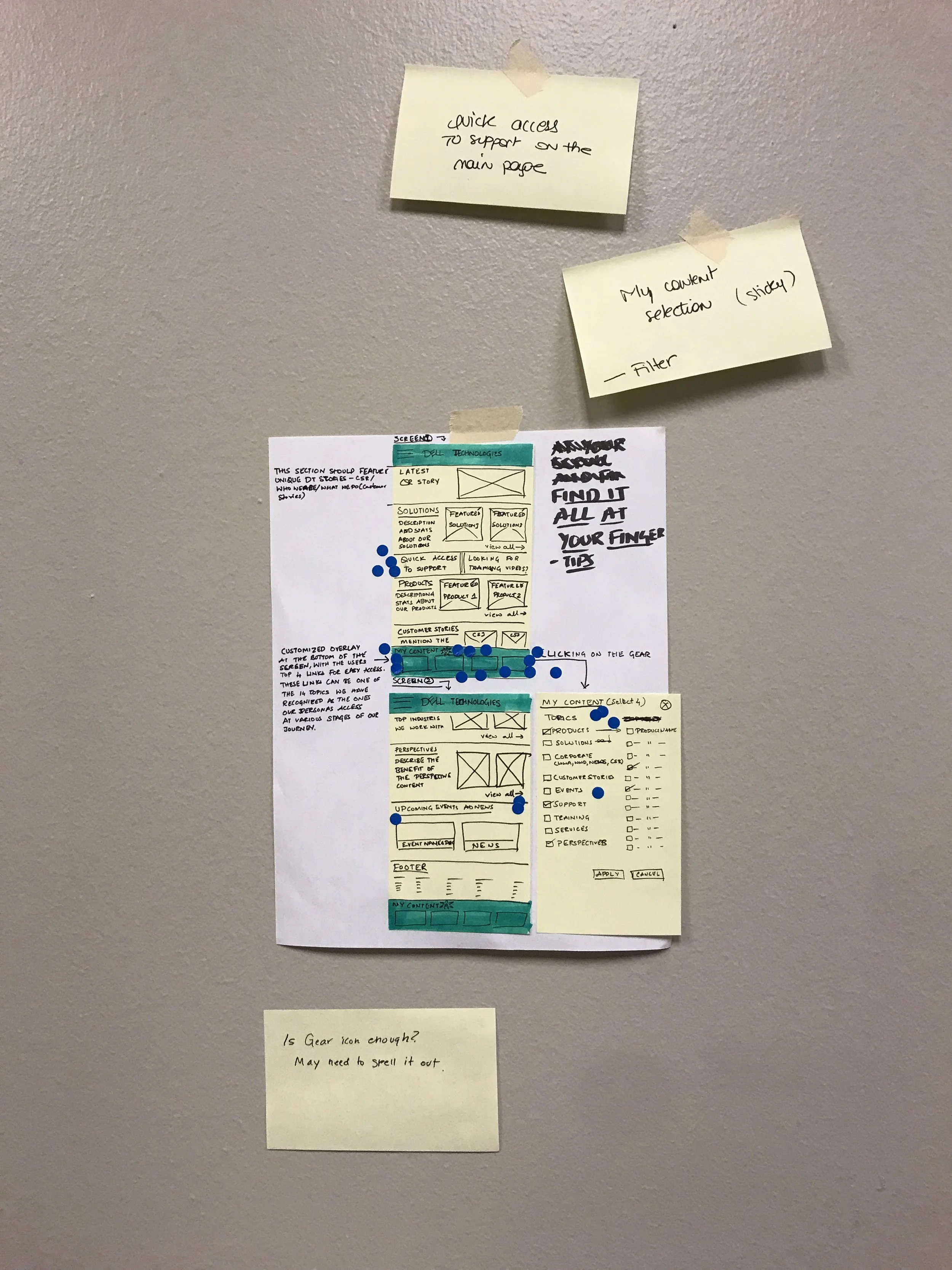
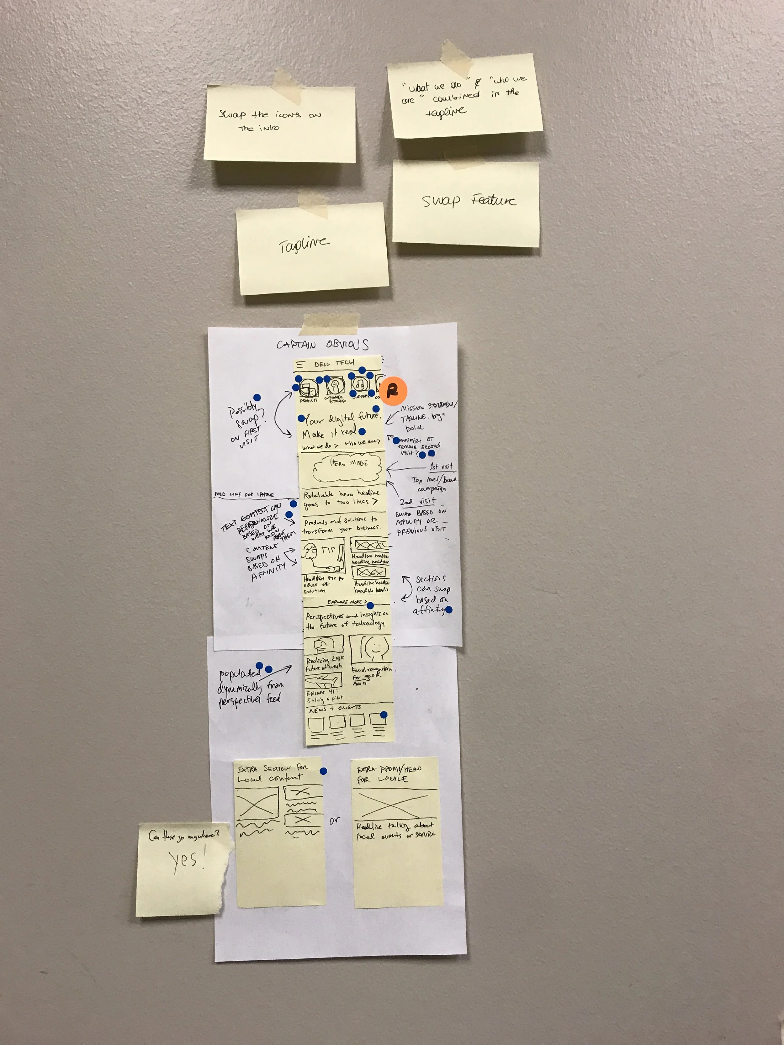
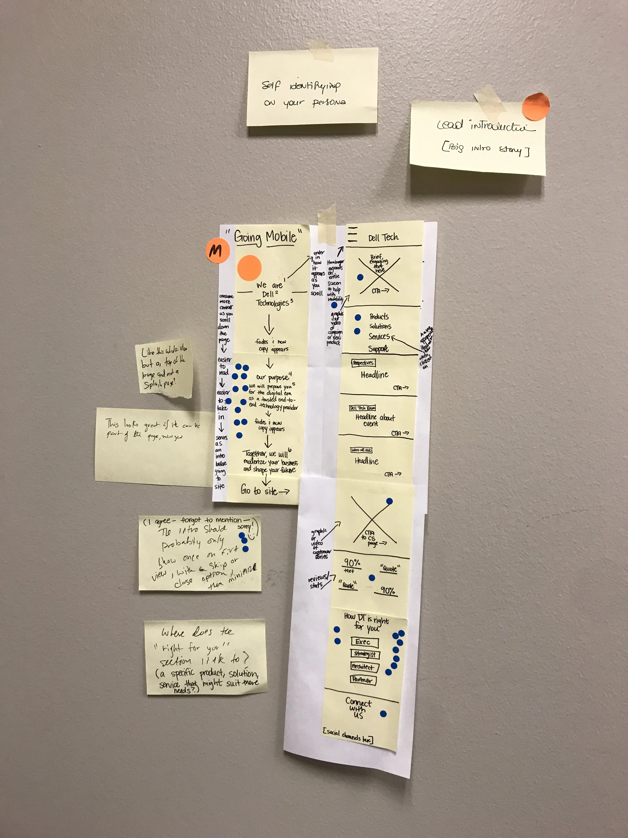
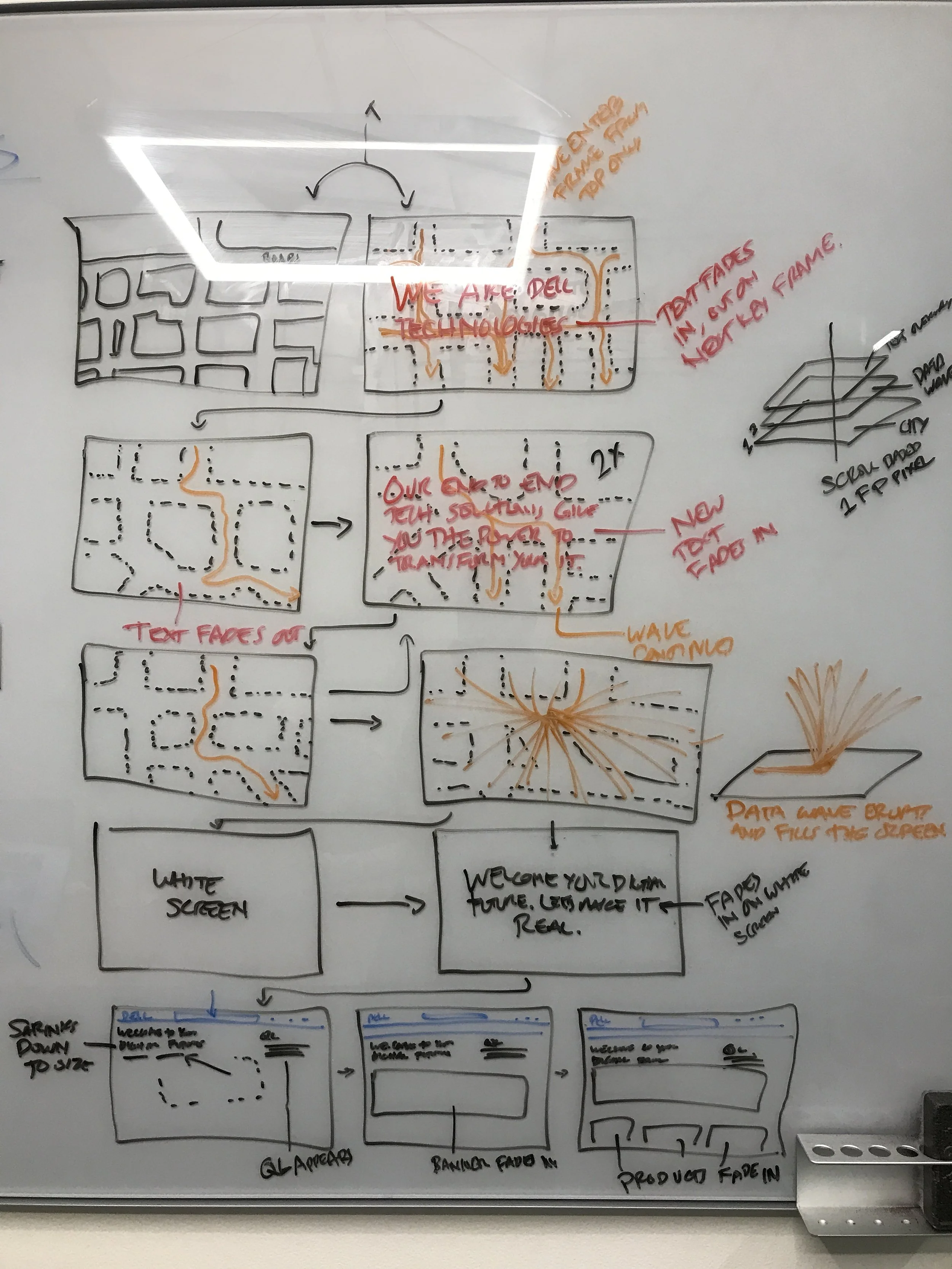
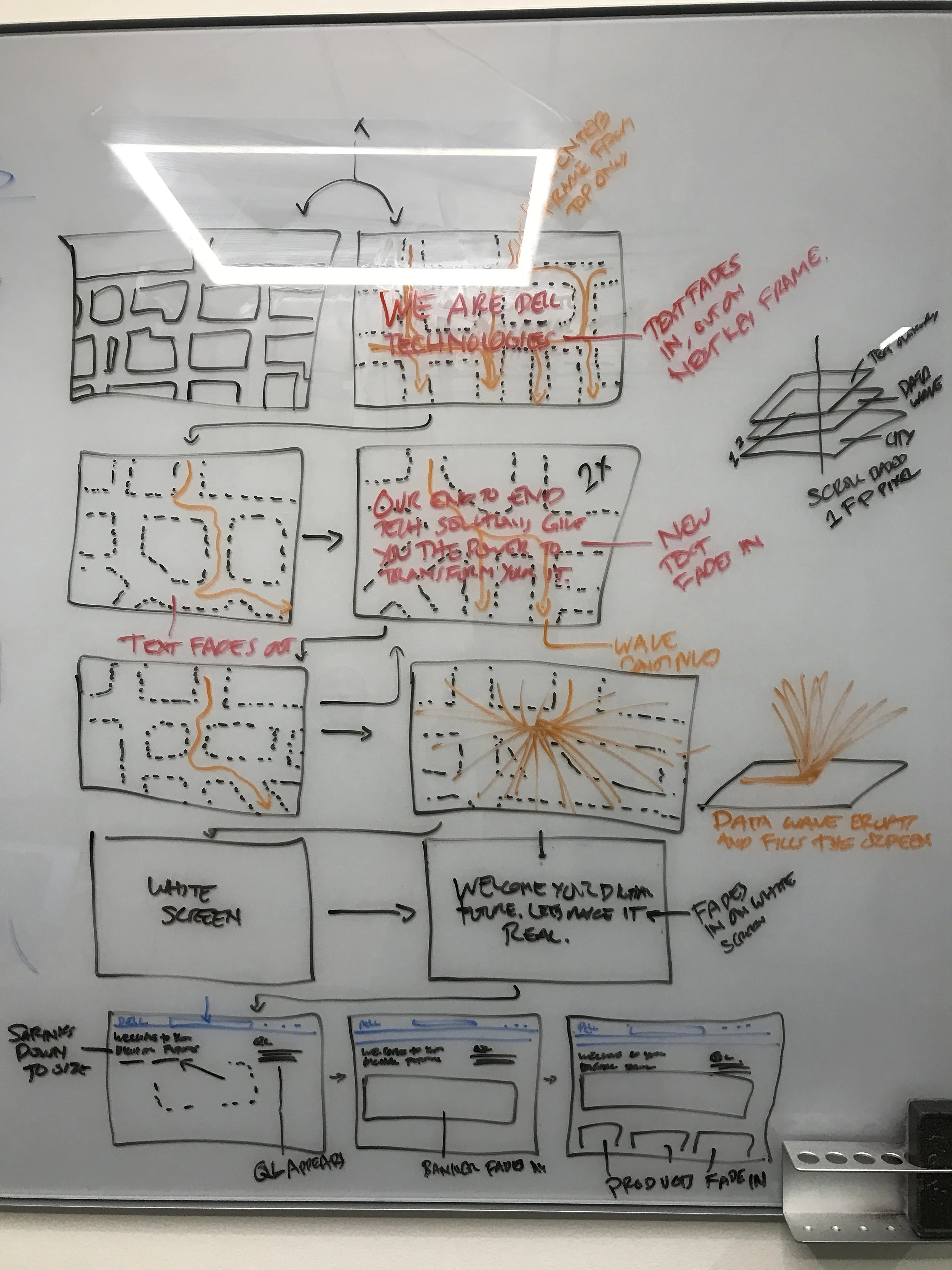
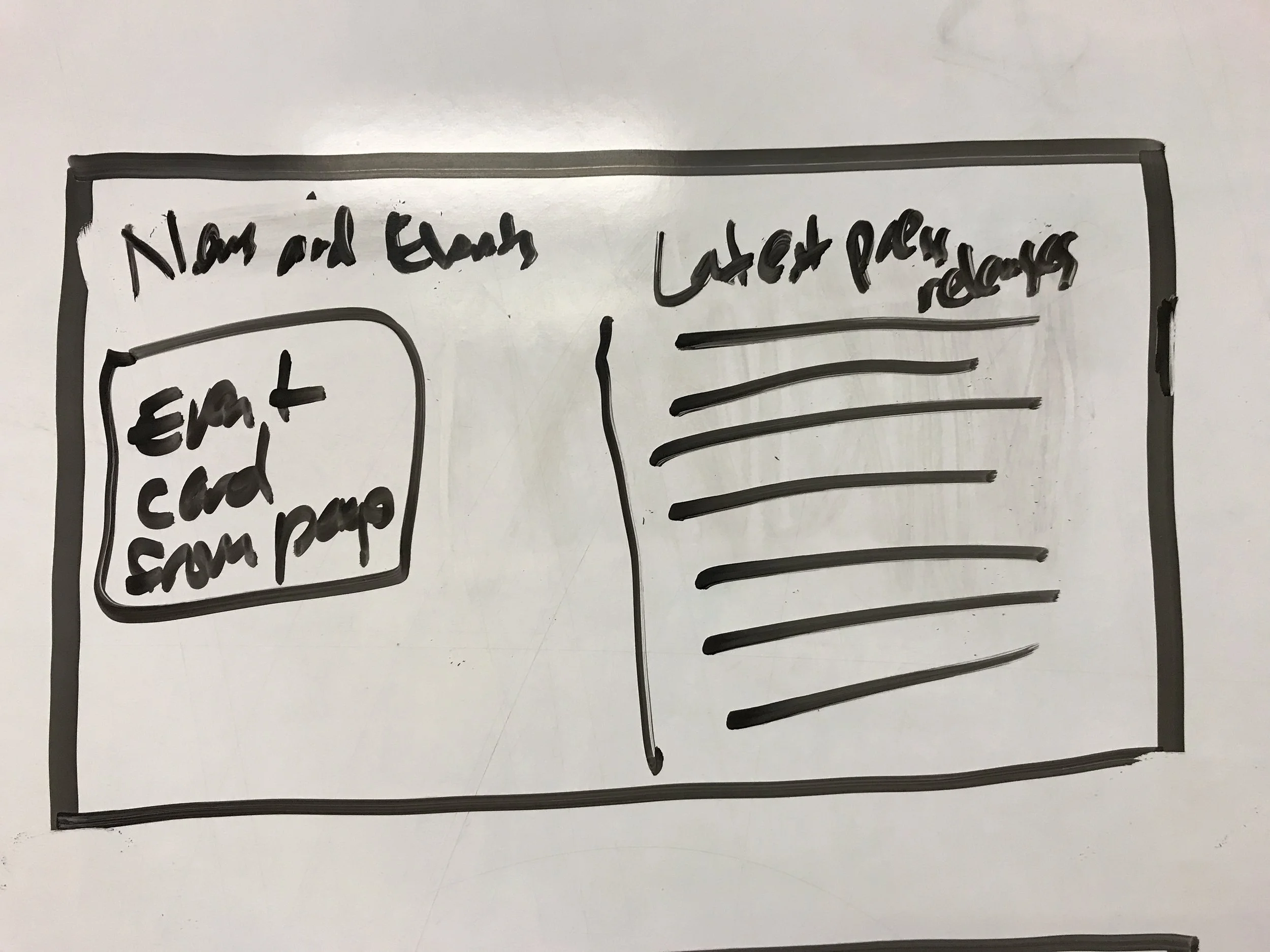
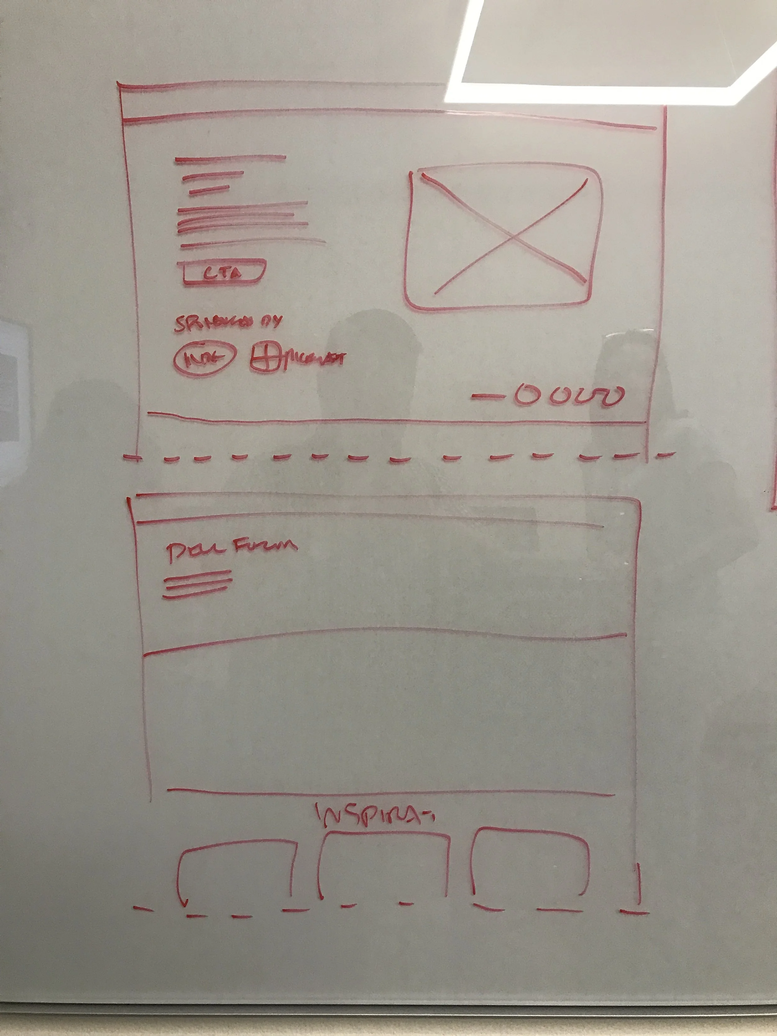
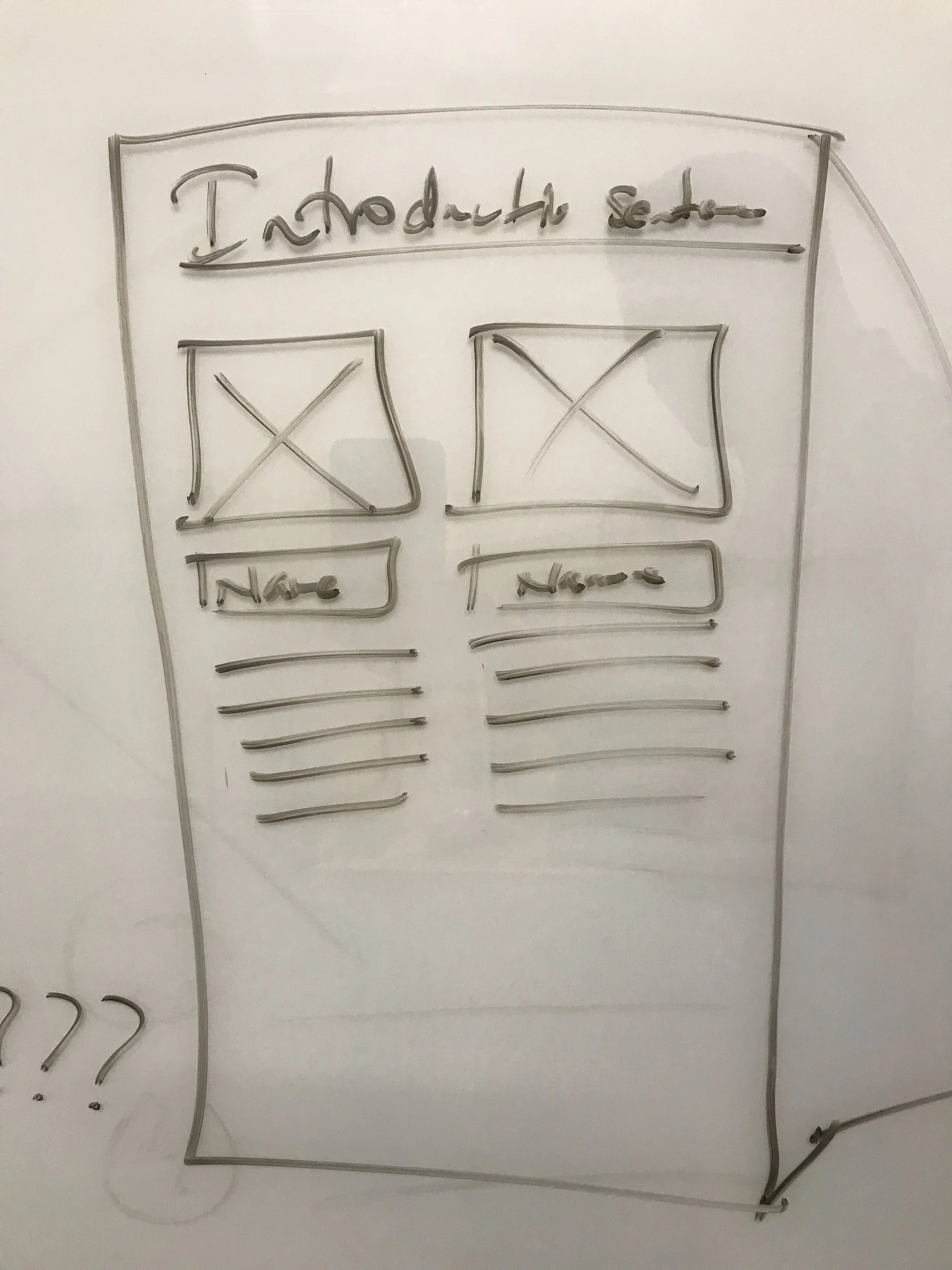
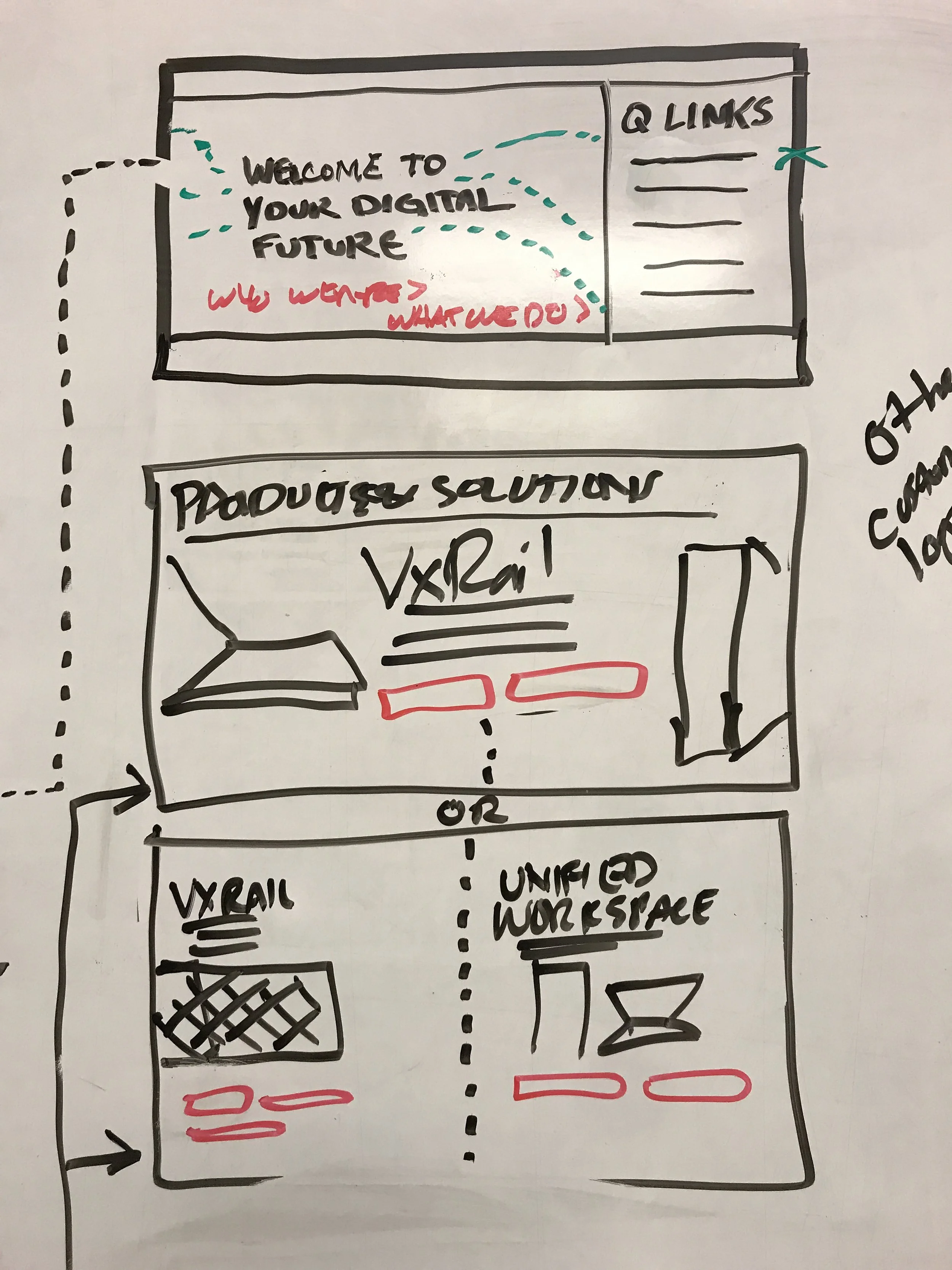
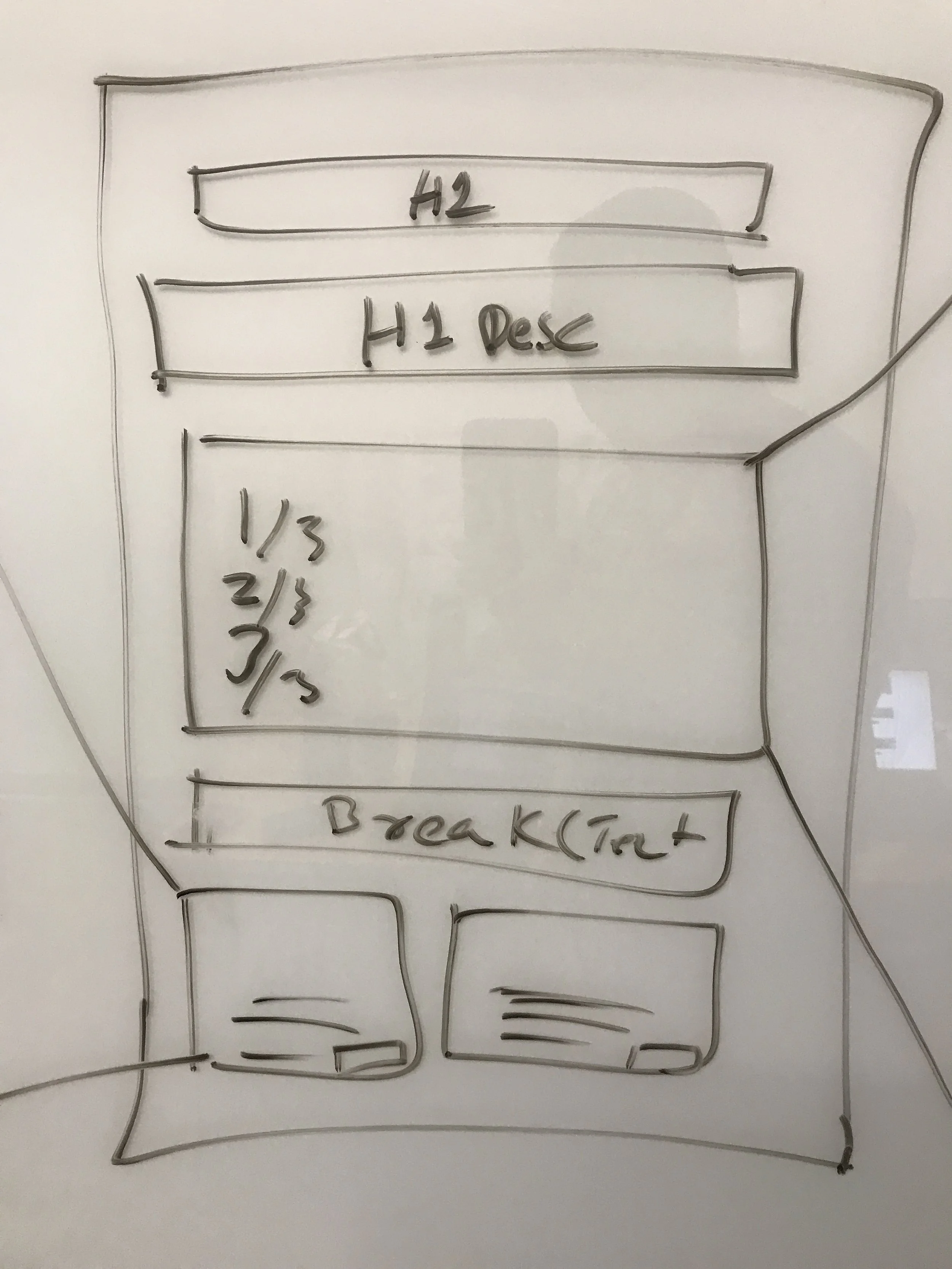
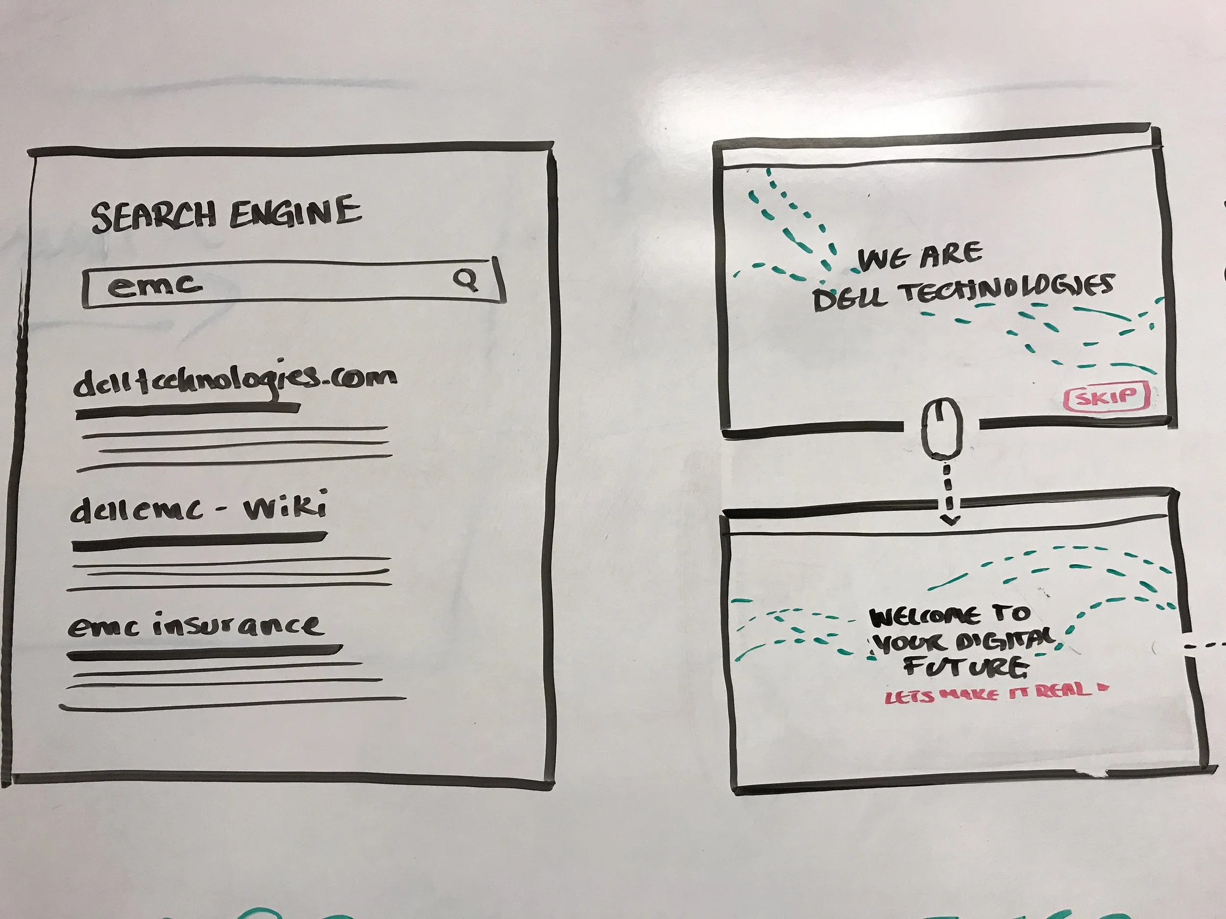
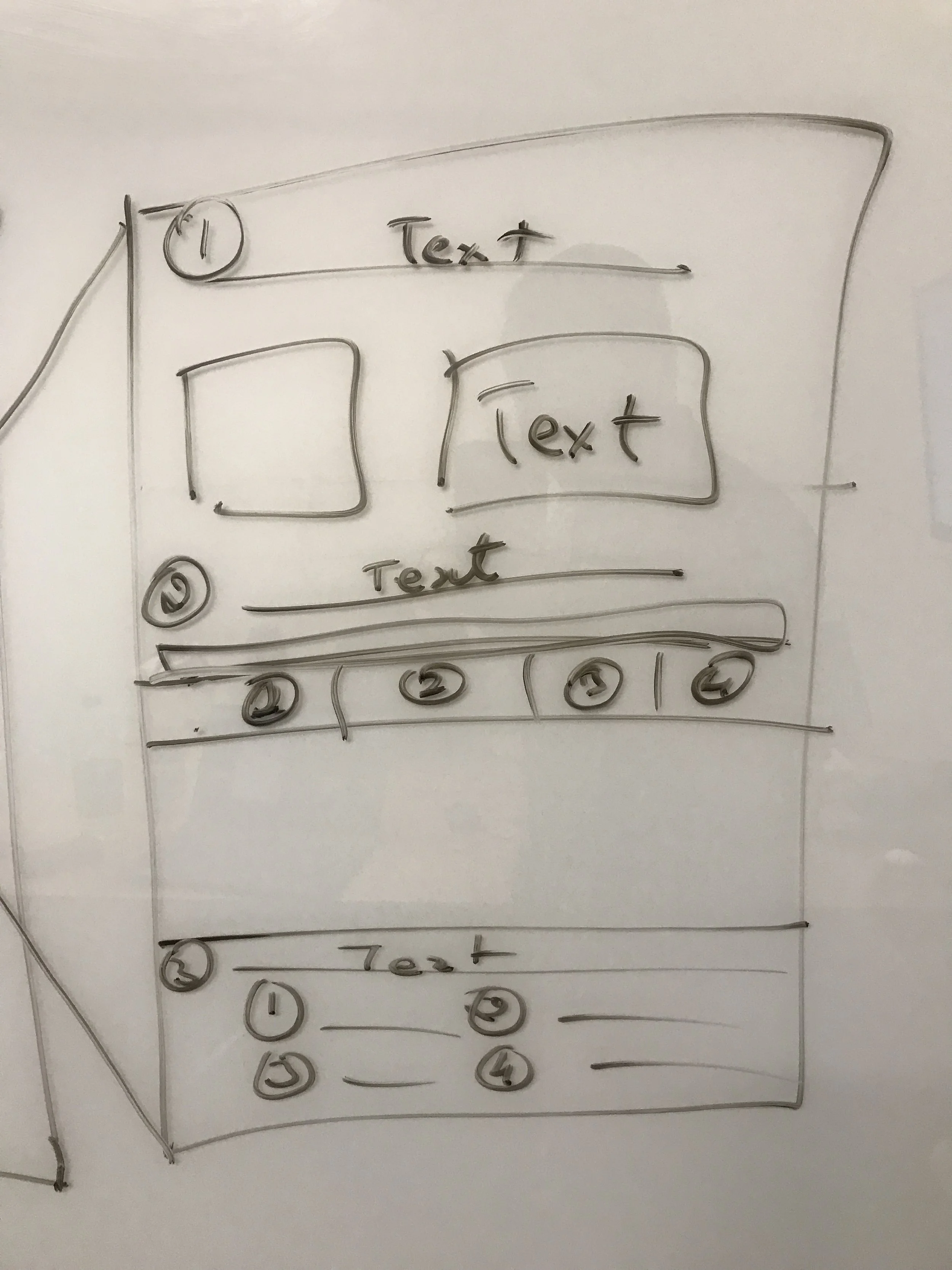
Once we’d identified this, we brought the entire team together for a week on site at a Dell campus (remember when that was a thing?) to conduct a mini one-week design sprint in which the whole team came together to listen to and understand the problems that the team had uncovered in its mini discovery (including a series of actual 1:1 customer interview recordings). The team then went through the process of unpacking ideas, generating concepts and ideas, and getting them up onto the wall (like an actual wall).
Step 6: Combination of all our best ideas into singular experience concepts
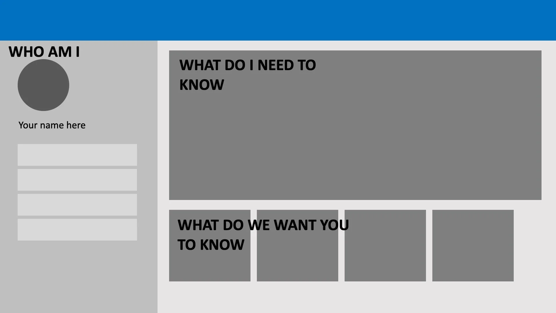
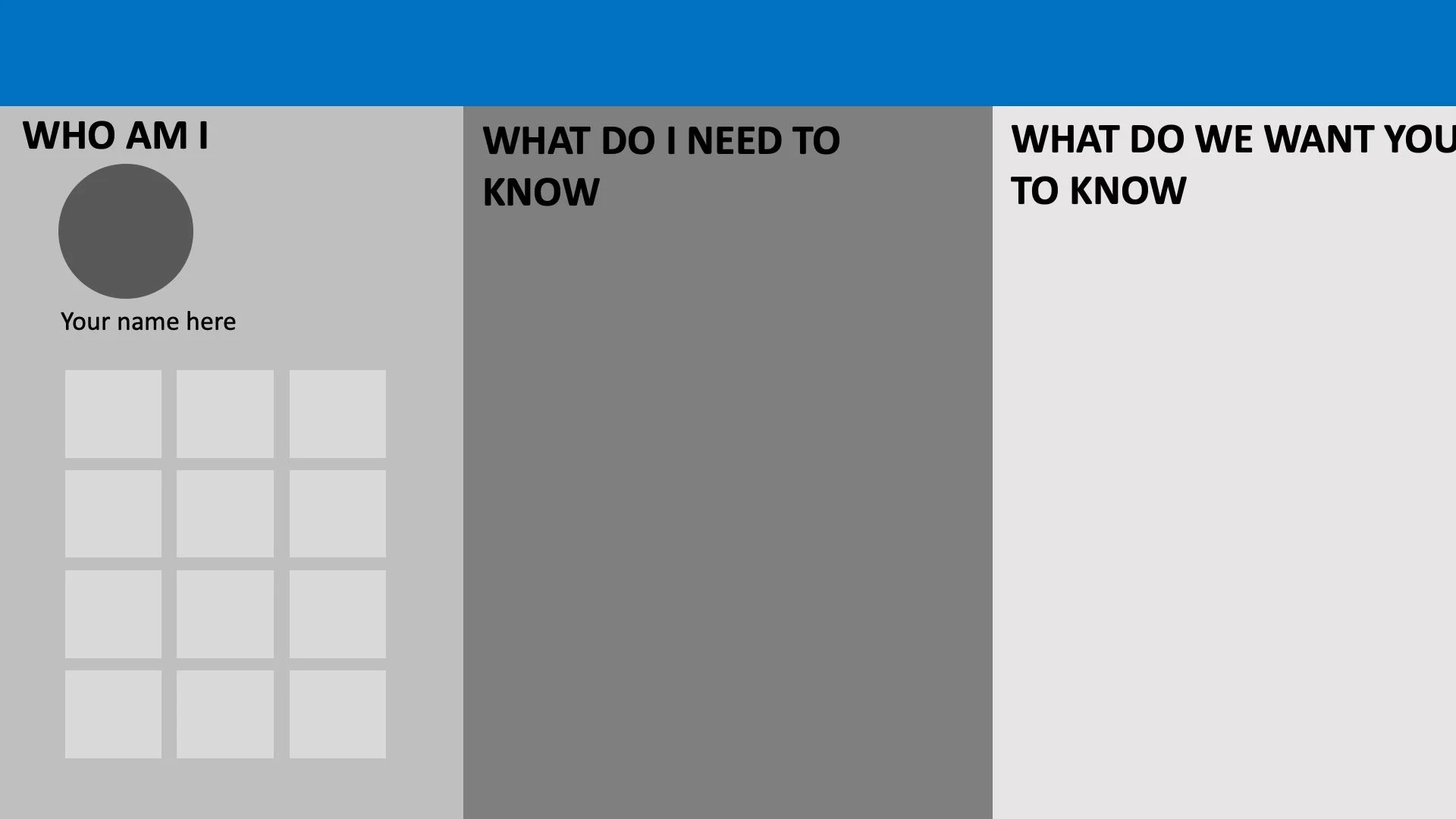
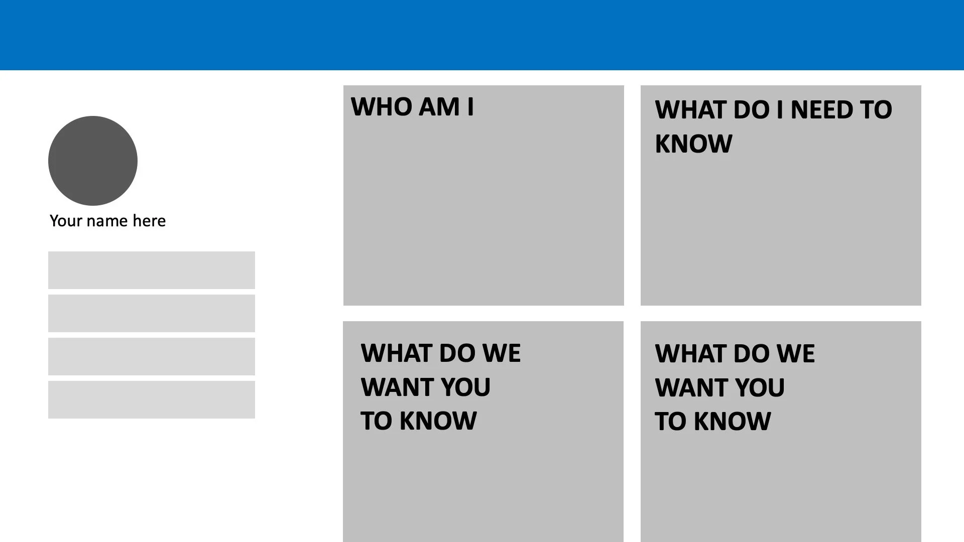
Finally, at the end of the sprint, the team took all the best ideas and concepts from each of our sketches and drawings and came up with a series of layouts that looked at how we could really turn our homepage from an infinitely long scrolled experience into a user-friendly home-screen that simply showed what a customer needed right then and there as they came to Dell Technologies.
Step 6: Wireframing and validating our top-three concepts
Once we had those, we did the same reduction process and extrapolated the top three ideas that had come out of it and invited customers to give us feedback, even at this early stage. We showed them how we imagined the homepage turning into a quasi-dashboard (with their personal details which I can’t show here) and let them explore the three approaches and concepts within them.
Step 7: Identifying the winner
Resoundingly our winner was the Home SCREEN. Perhaps unsurprisingly, this was the preferred option as customers loved the incredibly modular look and feel which still remained clearly a website homepage, but was able to scale and flex to serve them up the kinds of content that they were looking for without needing to learn and re-learn each time they came back. Because we’d borrowed ideas and concepts from other such homepage experiences (like Netflix, YouTube, Hulu, Apple News, and others), it felt like second nature to most customers to consume content in this way—even when promotional.
Step 8: Keep at it and flesh it out
So we kept going with the Home SCREEN and began to flesh out exactly how it should work, how it should scale, and what kinds of content modules we’d want to be able to populate it with and all the scenarios that we’d need to support. As we got closer to visual design, we began to really look at the interaction patterns and subtle micro-animations that could make the experience feel even more tactile. We began to integrate gradients, shadows, radial corners, and light and depth to create tactility among the tiles. In the end, what we decided was that they should feel like you could drag and drop them anyhow and anywhere you wanted to.
The experience below was populated again with real customer content and put out to test, to resounding results in moderated testing, unmoderated studies, and finally through a production A/B test where we saw incredible results, even with very little personalization of content.
The final Homepage 2.0 Experience
Homepage or homescreen?
Homepage 2.0’s biggest departure from homepages of the past was that, for the first time, we eschewed the traditional marketing-style approach of featuring big splashy images and long and often ambiguous copy for simple, sleek tiles that allowed us to take almost more of an app-driven approach to content.
Tiles on the homepage were shortcuts deeper into the site’s taxonomy, and the overall layout functioned much more like a home-screen than a home-page, the result of which our customers responded incredibly favorably to.
Reducing the scroll, drastically.
As is true across DellTechnologies, users just don’t scroll. Period. And even though we had designed the megapage to reduce the need to scroll, in Homepage 2.0 we took a radically different approach by reducing the scroll by more than half, this move made possible by our tiled approach. The entire End-to-End Solution (products, solutions, services) and We are Dell Technologies (corporate messaging, events, reporting) content would be visible within a single scroll below the hero, giving our users a true, thousand-foot view of everything available to them on the page.
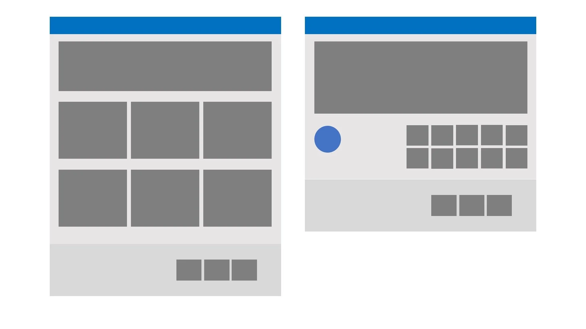
And the layout allowed us to carry this design principle through across responsive
And much like any other experience designed with app-tiles, the layout allowed us to build in incredible amounts of flexibility to scale the experience across screens of all shapes and sizes without losing the cognitive recognition or ability to interact with it.
A better experience for designers, writers, developers, and of course, our users. So, everyone, really.
We also knew immediately that our new design had to fully support a flexible, modular architecture that would allow us to deliberately disrupt content based on business need. As such, the vision called for a new Delta component to be developed to specifically support the new homepage.
The component would support multiple views that would allow us to choose a layout on the fly and quickly populate it with content, rather than having to hard-code (or hack code) customizations the way we do today. There would always be a standard layout, but when a high-profile launch or event was in progress, we could choose a different view which would allow us to deliberately disrupt the page and create clear levels of hierarchy and immediately draw our users’ attention to the hot new content on the page.
Ready to handle the demands of a global site
Our concept also allowed us to support a truly global experience; the page could be rolled out globally with the component natively and automatically handling translation and regional rollout. Conversely, for regional or region-specific deviations (local events or needing to omit product from a specific locale), the component view and content could be quickly and easily tailored and customized for the needs of that specific region. In the example above, we might have a corporate campaign going live but only for the Japanese market. In this case, we could simply change the component view for just the /JP-JP/ page (adding the large promo on the left and letting the component dynamically rearrange the rest of the content), while leaving the /EN-US/ experience intact.
The final result created a page that increased engagement, content visibility, and comprehension across the board for Dell Technologies.
The final result was a page that really changed the way we thought about the homepage. It became less about flashy imagery and fluffy messaging and more about the strategy behind where we and our business unit partners were trying to drive traffic. The idea of getting people OFF THE PAGE as quickly as possible was something new for our stakeholders, but once they realized that it not only helped customers get to their content more quickly and efficiently, but also increased the amount of content they could surface, they were thrilled.
As we have gone through the design and strategy iteration, we’ve engaged our customer-base for validation and feedback through moderated and unmoderated user testing, all of which has been exceptionally positive. Users praise how clean the layout is, how it allows them to quickly navigate the page, and how short the scroll is, allowing them to quickly and easily get a solid, thousand-foot view of everything that DellTechnologies.com has to offer.
But we didn’t just stop at today — we imagined what could possibly come next
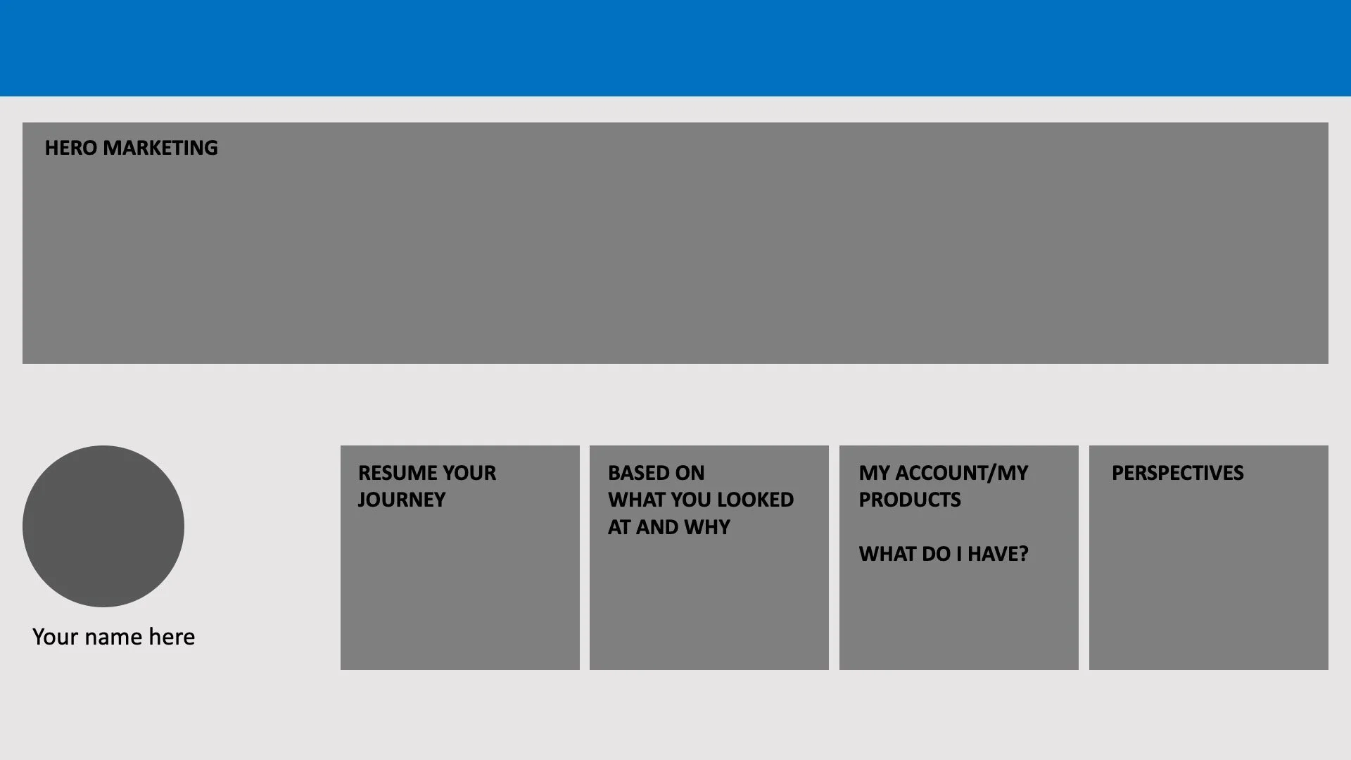
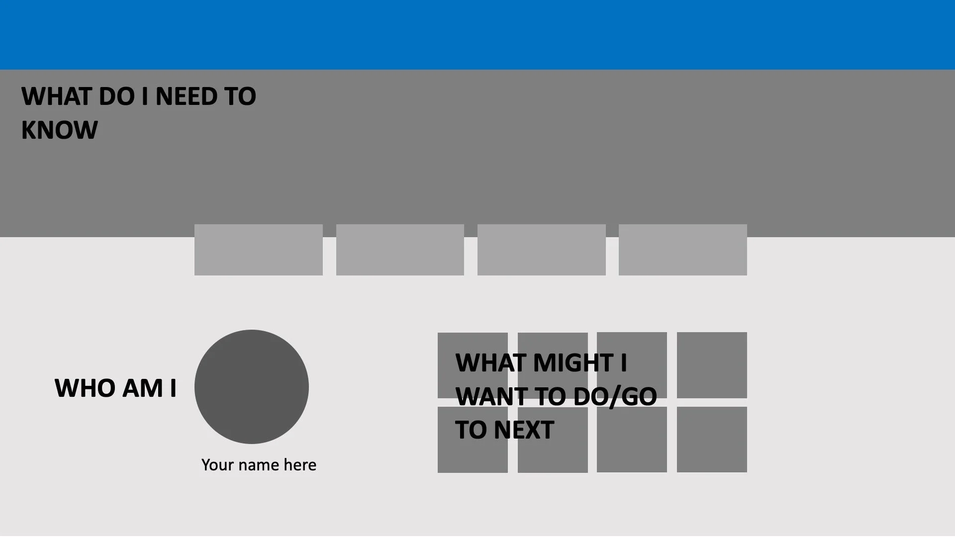
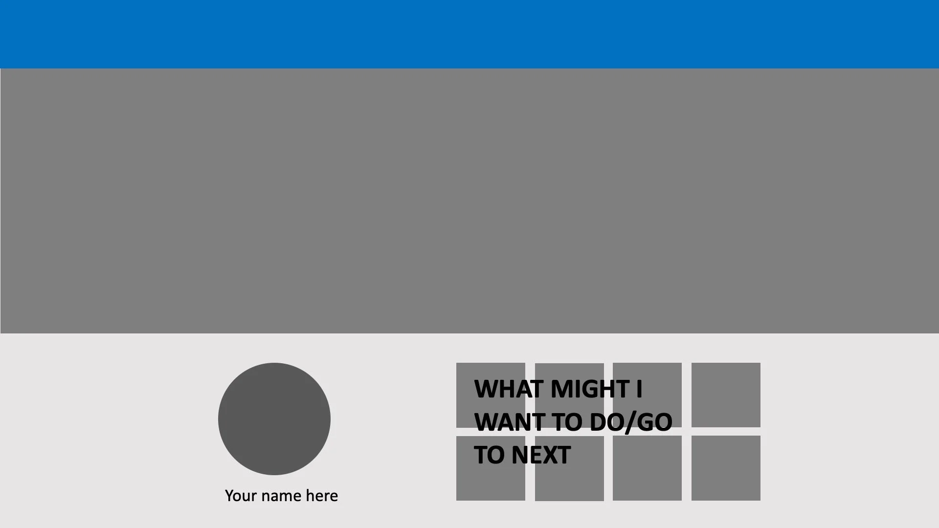
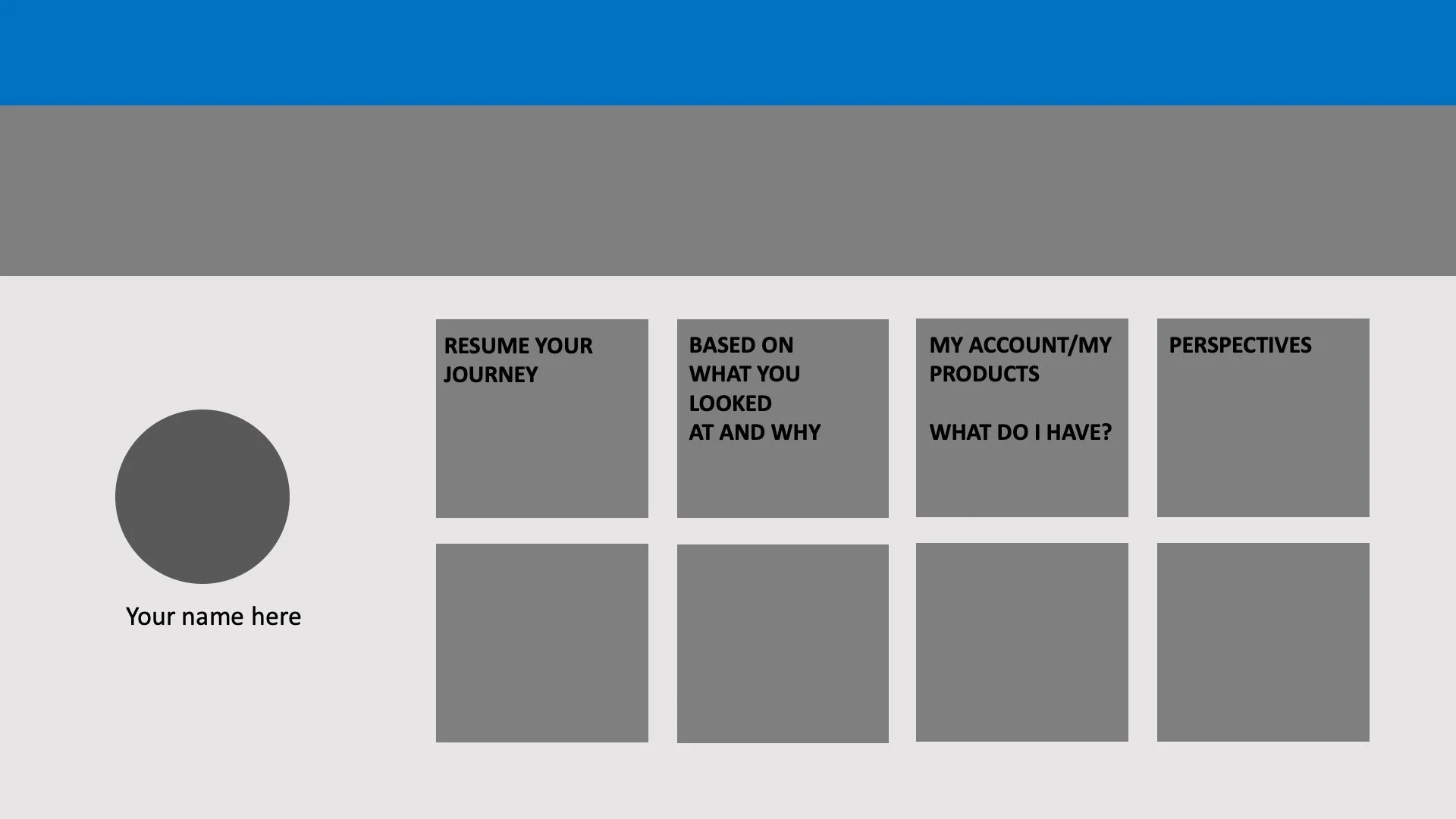
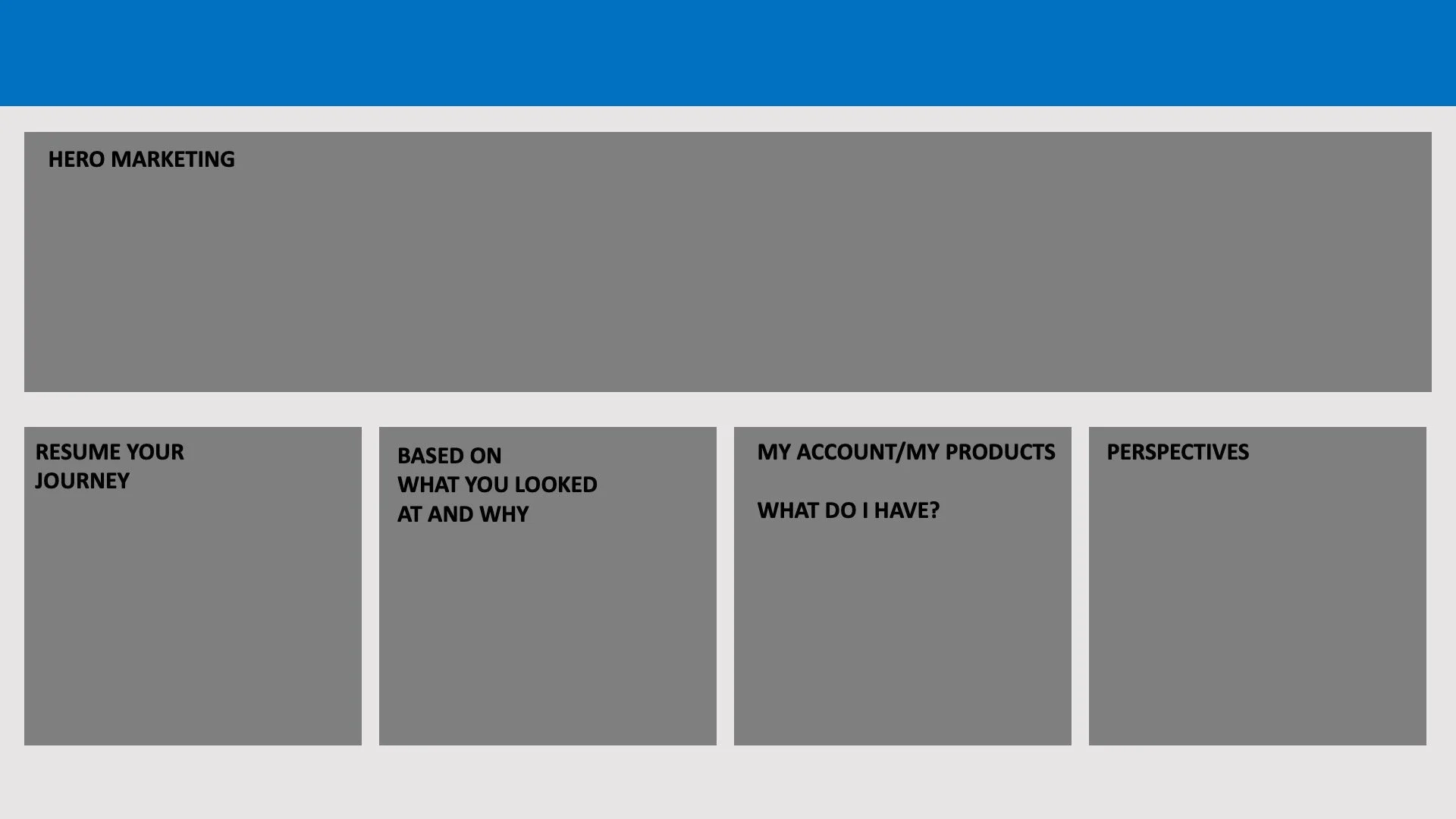
Dell is ever-changing and as the company moves closer and closer to its end goal of a fully personalized experience for its customers, we imagined how Hompage 2.0 could adapt and change as well, without actually changing much about its underlying architecture. Because we’d set it up from the get go to be a dashboard-like experience, we imagined the same modular architecture supporting new components and micro-services connected to things like customers products, accounts, and more to serve them up even more relevant and timely information; truly turning their homepage into a Home Screen.
ROLE: Product Strategy, UX & Visual Design Lead
CLIENT: Dell Technologies (Full-Time)
