Josh Lee James
Digital Product Strategist | Human Experience Evangelist
To realize its vision of an all-encompassing visual language and design system, Dell Digital needed a full set of new, contrast/WCAG compliant colors.

The standard brand palette

Dell’s existing palette, though not designed for digital and not WCAG compliant, was actually quite usable. So, when the team began this exploration, it was a solid staritng point. From there, the team would extend the palette fully up to white, and fully down to black; and in between arrive at colors that would support DLS 2.0’s dark and light modes.
New supporting colors
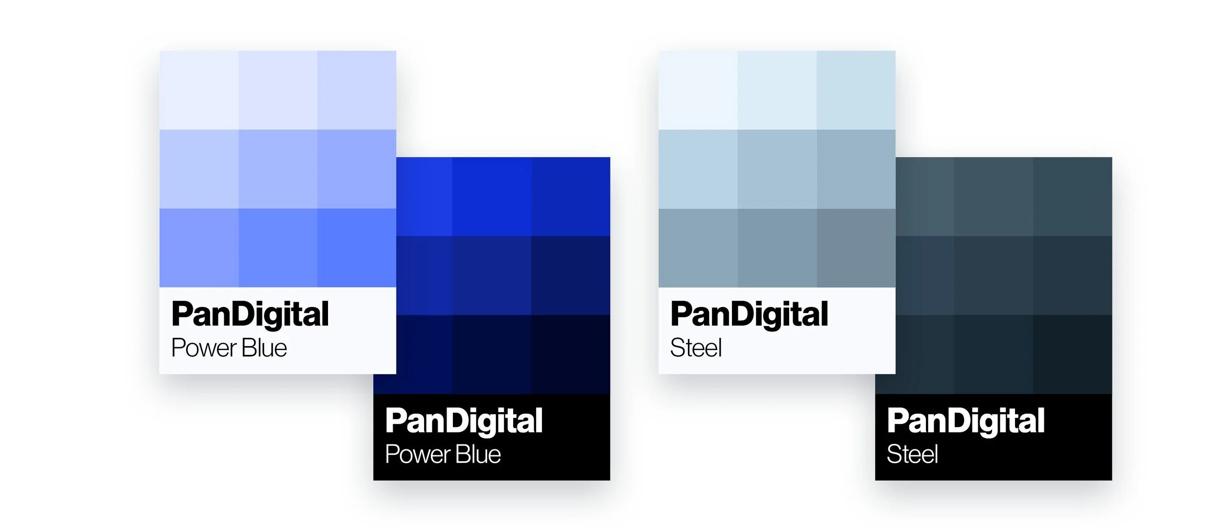
One of the biggest challenges when working within Dell’s brand is the single use of Dell Blue across all brands, business units, and product verticals. This becomes especially problematic when we start looking at how to differentiate between Consumer, Small Business, Mid-Market, and Enterprise. Specifically when we begin to draw the biggest line between consumer/small business and mid-market/enterprise where products, pricing, and service standards most drastically differ. The team drew inspiration from the actual product consumed by our large-scale customers (DellEMC PowerScale, PowerStore, PowerFlex, Data Domain, etc.) and came up with a whole new Blue, which we aptly named Power Blue.
The new digital palette


The new digital palette was the result of a complete extension of each standard color (plus those of our two new colors), into a series of 18 colors that spans both light and dark. This was critical for us to be able to take this as a starting point and begin to use these colors as the baseline for the new design language system that will power all future Dell Digital products and experiences.
Designed to support full-spectrum accessibility
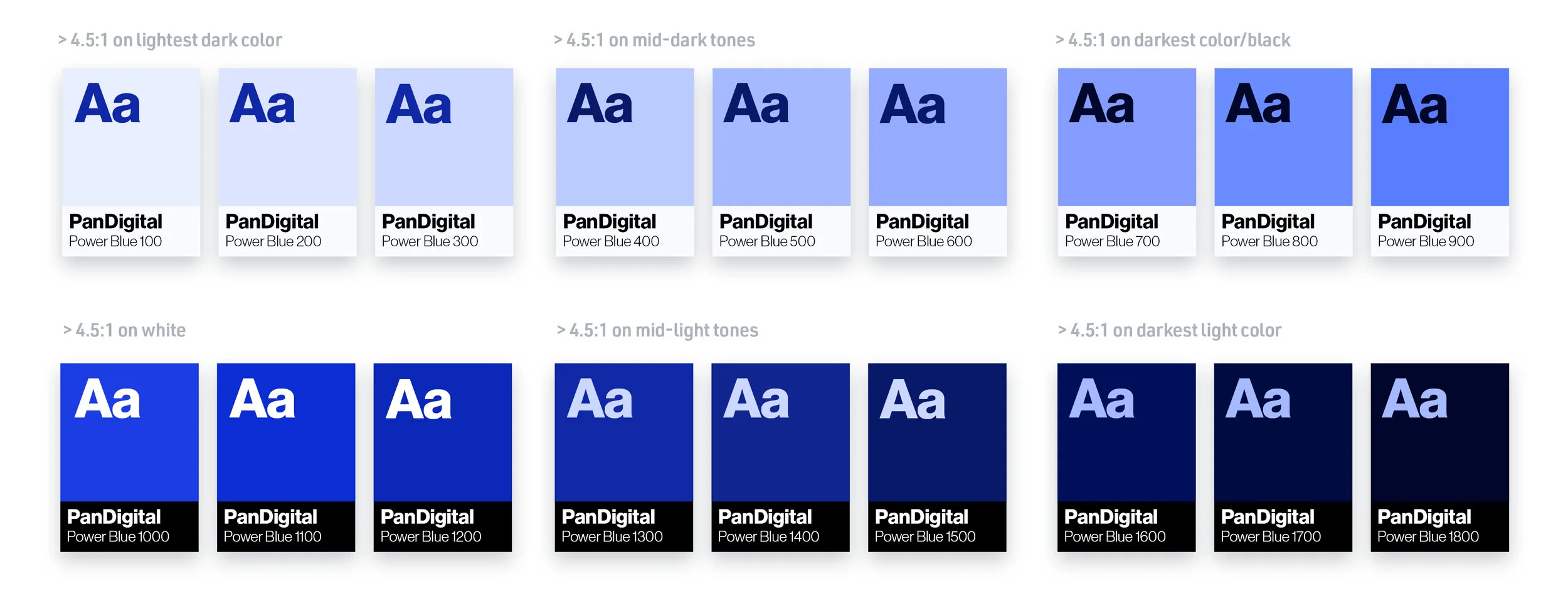
As we developed the color strategy, we also kept a firm hand on accessibility and rules that the future design system will need for full WCAG 2.1 AAA compatibility. As such, with each of our 9 light and 9 dark colors, 3 of each must meet >4.5:1 contrast on each of our lightest, mid, and darkest tones respectively.
So what was the point of all of this?

In short, the point was for Dell to be able to realize the next-generation of its digital experience. We needed an expanded color palette to realize the potential of a strong, world-class design system that would power everything from on-device applications to our website to our dashboards. In short, it was needed to modernize the entire digital ecosystem.

Check out our Concept Light look and feel for Dell’s Digital Design System to see how the new brand palette allowed us to realize a totally new and thoroughly modern visual language system that is being rolled out across the digital ecosystem.
ROLE: Sr. Design Strategist, Art Director
CLIENT: Dell Technologies (full time)